How to 3D Print Text & Letters – Simply Explained

3D printing text, especially in decorative fonts, can be a challenge. Read on for some tips you can use to design and 3D print text.
3D printing has a wide range of applications, and objects with embossed or debossed text are a popular option. Text can include words, numbers, punctuation, and other characters, and can be a little tricky to 3D print. That’s because, especially in a long string of text, there are many small details and edges, and they all have to be printed cleanly. Otherwise, you may not be able to make out what it says!
When it comes to 3D printing text, the printed script’s quality doesn’t just start with your printer. The 3D design and slicer settings also play a significant role in how your 3D printed text will appear.
In this article, we’ll be going over some tips for 3D printing text. We’ll review some design tips, useful slicer settings, and even some hardware advice.
Designing the Text
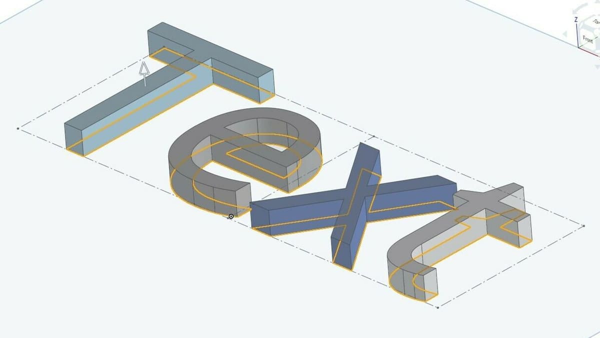
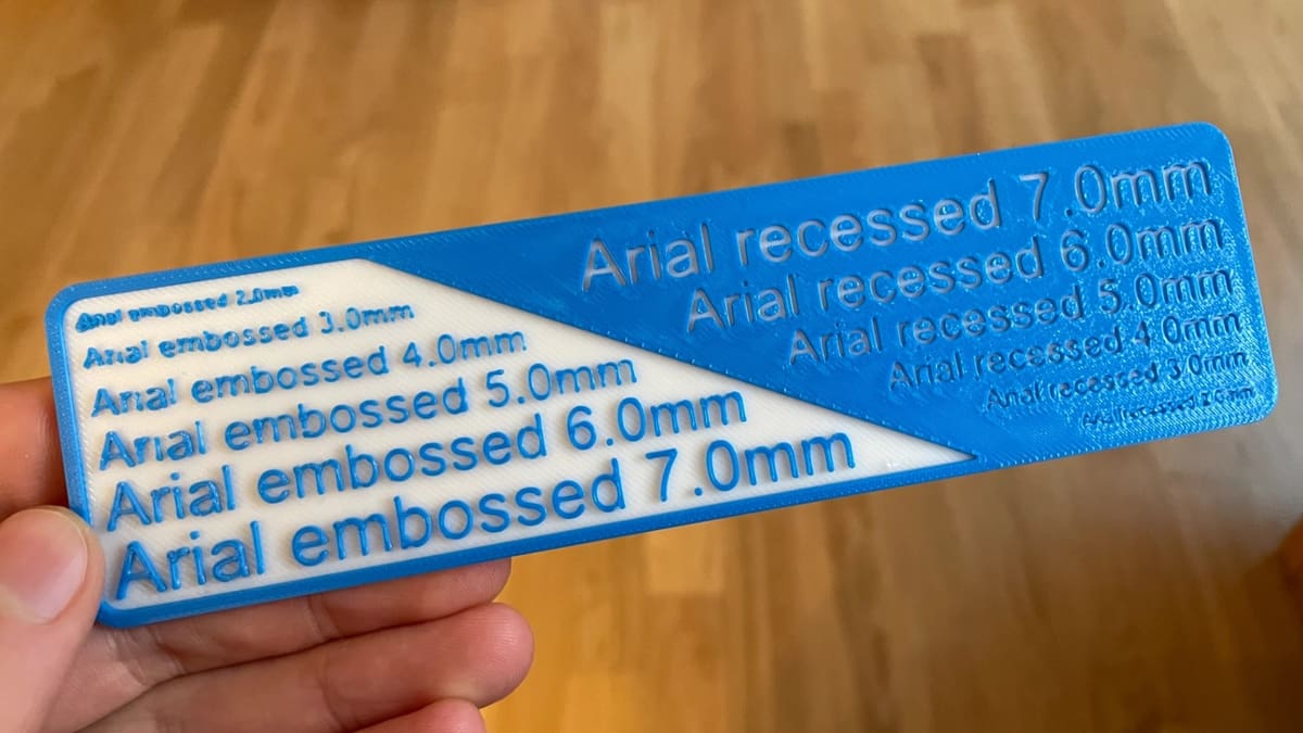
The first step in any 3D print is the design; even a perfect printer with all the right slicer settings can’t make a poorly-designed part look good or function properly. Designing text is much easier nowadays, as most computer-aided design (CAD) programs, such as Blender and Autodesk’s Fusion, have text box tools. You can use text boxes to either emboss (raise or extrude) or deboss (lower or sink) text, depending on how you want your model to appear.
After opening the model you want to add text to in your CAD program, create a text box and copy or type in whatever words, letters, or other characters you want to be printed. Then extrude or remove the text at least a millimeter from the surrounding surface, so it will be clearly visible.
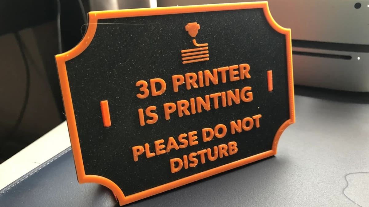
Embossed 3D printed text is usually easier to see on a model, but if you can’t afford the extra print time, want to conserve material, or just prefer the appearance of text sunk into a surface, then debossing is still a great option. Additionally (depending on what you’re printing on and the purpose of the model), feel free to raise this emboss or deboss value, because the greater the height difference from the surrounding surfaces, the easier the text will be to see.
Font & Spacing
Besides the height or sink of the 3D printed text, there are a few other factors to consider when designing your text. Let’s take a closer look!
Font
Regarding font, the simpler, the better, because fine details mean directional changes, tight corners, and so on. Depending on your CAD program, you’ll have different fonts to choose from, but Open Sans is a plain and simple font found on many programs.
If you have your heart set on a serif, cursive, or another decorative font, just be warned that it might not turn out as you hope, especially if your text will be printed at a small size. Fonts with joined-up letters will be particularly difficult to read when printed and are probably better to avoid.
Character width is also important, by which we mean the minimum width of the characters or letters in your design. While this may only apply to some CAD software, if you can, adjust the width of each stroke (i.e. the width of a letter ‘I’) to be at least twice the diameter of your nozzle. This allows your nozzle to make at least two passes through each part of an embossed character, so it should be clear enough to read.
Spacing
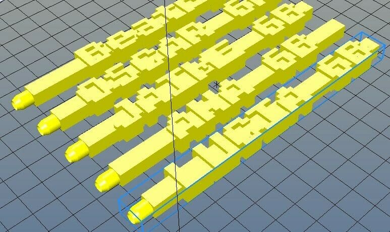
Another factor to consider when designing your text is character spacing. Letters set close together might be difficult to distinguish when 3D printed, even if they’re legible on your screen. To address this, look for tracking and kerning settings in your design program. Tracking is the spacing applied across a whole word, whereas kerning is the space between two letters. For the purposes of 3D printed text, slightly increasing the tracking for the whole text is a good place to start.
Additionally, make sure that if you have multiple lines of text, the line spacing (leading) allows enough room. For example, you wouldn’t want the bottom part of a ‘y’ to touch the top of an ‘f’ in the line below. If you can’t adjust the line spacing to your satisfaction, you can always place each line (or even each letter) in its own text box and then position them as you prefer.
If you want to print text without a base surface (e.g. a decorative sign), note that all the letters or symbols need to be joined (so cursive typography would be useful). Otherwise, the individual letters and symbols will be printed separately and you’ll then have to glue them together – unless that’s exactly what you’re looking for.
Now that we know how to design our text, let’s move on to the slicer settings!
Slicer Settings
Slicer settings are what’s adjusted in a 3D slicer to meet your priorities for each new print, whether this is printing time, detail, or strength. There are a few helpful slicer settings for printing text that you can adjust or activate to achieve the highest quality prints.
Orientation & Supports
Make sure you’ve oriented your text so that it will print without any supports, as these can make the outer surface of your text look bad. If you’re unable to completely avoid supports, try to minimize their use around the characters themselves, even if that means more supports in other areas of the part.
Walls, Infill & Top Layers
You’ll also want your walls to be set thick enough that no infill features on the text. For example, if your character width is 1 mm, set a wall thickness of at least 0.5 mm (two walls, so 1 mm in total) so that the entire text will be printed as walls. You don’t want infill in your characters because the space is so small, and solid letters will be stronger. Also, ensure that you have at least one or two solid top layers so that the letters will appear solid and cover any gaps between the walls.
Generic Settings
As for all prints, make sure that all your generic slicer settings, like temperature and retraction, are just right. A good temperature means your text won’t show any obvious under- or over-extrusion. A tuned-in retraction distance and speed can prevent stringing between the individual characters of your text.
Layer Height
Lastly, make sure that your layer height is small, especially if your text’s thickness is also small. It’s a good idea to set your layer height as a multiple of the height of the letters so that they’re printed with a whole number of layers.
Printing Advice
Once your model with text is designed and sliced, it’s time to print it! Many of the tips we discuss below are basic calibration activities but are still key to a good text print.
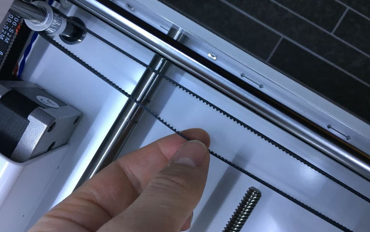
Firstly, make sure to tighten your printer’s axis belts. Tightening them removes any slack in the belts and attached carriages, making your prints more dimensionally accurate. Doing this will also help your machine print circles correctly, which is helpful for printing letters like ‘O’ and ‘Q’.
As with any print, don’t forget to level your print bed as the first layer can determine the rest of the print’s fate. Leveling your bed will establish an adequate first layer that the rest of your print can be built on top of. This process will help increase print quality for text, as it does for virtually all prints.
Another thing to remember is to always check that your E-steps are accurate (no under- or over-extrusion) and that your nozzle isn’t clogged. If your nozzle is clogged, this can lead to under-extrusion or complete print failures where the nozzle stops extruding filament. Lastly, make sure to clean your nozzle with a damp cloth so that nothing sticks to it during the printing process.

License: The text of "How to 3D Print Text & Letters – Simply Explained" by All3DP is licensed under a Creative Commons Attribution 4.0 International License.