How many people live in a particular country? And how rich or poor are they? Of course, these questions can be answered by providing numbers. But that is very abstract.
That is the reason Volker Schweisfurth from MeliesArt came up with a clever idea: Why not make the abstract figures more tangible? That’s why he created his DataSculptures project and uses 3D printing to transform data into 3D sculptures.
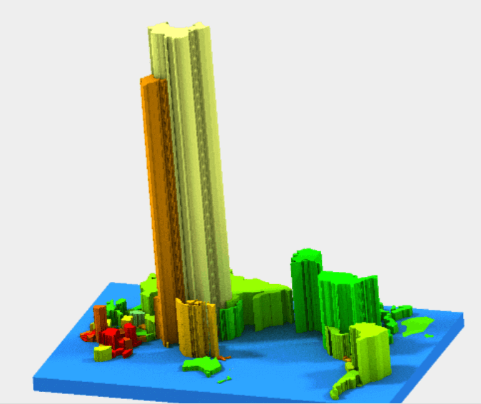
For this 3D printed world map he obtained data provided from World Bank (the 3D map is based on data from 2012). The 3D DataSculpture uses two parameters: size of population as height and per capita income (in US$) as color spectrum – green means richer, yellow means medium and red is poor.
Interestingly the two most populated countries – Chinda and India – are close neighbours, and they stick out linke twin towers. And even small details are visible and touchable – e.g. the islands of New Zealand.
At €56 (matte finish) the 3D world map is a good investment for schools and high schools – and for schools for visually impaired. It makes abstract numbers concrete and tangible.
License: The text of "3D world map by population and income" by All3DP is licensed under a Creative Commons Attribution 4.0 International License.